Beach Sherpa is an evolving brand, and our logo journey reflects that well. Launching in Wrightsville Beach, we are excited about our future and want to build the best brand that we can while also building our community.
As some of you may know, the parent company of Beach Sherpa is called Sherps. This name is an exciting indicator of some future plans, but right now it’s all about Wilmington, NC baby!
Our logo evolution is a great way to see some of our journey up until this point. So, without further ado, the iterations of our logo thus far. (Check back with us in 6 months or a year… we’re sure that there will be more changes to note.)
Logo 1: Beachy but Busy
Our very first logo came courtesy of a friend of our founder. Jackson, with the help of DALL-E created this initial logo to represent the idea that our Sherps are there for you, not only to carry your things but to help make your beach day the best, most stress-free that it can be. Jackson is very talented (check out his photography insta @sandyshutter,) and we loved this version.
Like all great ideas, though, we knew we would have to leave some room for growth. This logo is busy, and we weren’t quite sure about the shawl vibe. As great as AI can be at helping with ideation, some things get a bit lost in translation.
This depiction of our Sherps draws heavily on the attire of the traditionally eastern Sherpas whose title helped to inspire the company, but you’ll see our staff in t-shirts on the beach… and we knew the logo needed to align with this.
Logo 2: Fitting but Less Functional
Now, our second logo was created by our founder, also with the help of DALL-E. He loved it (maybe still does) because it is the first “Sherps” logo, but the colors were not easy to work with. Even though tan is the color of sand, it’s not fantastic for branding.
This logo was quickly adjusted into what you’ll see became logo 3.
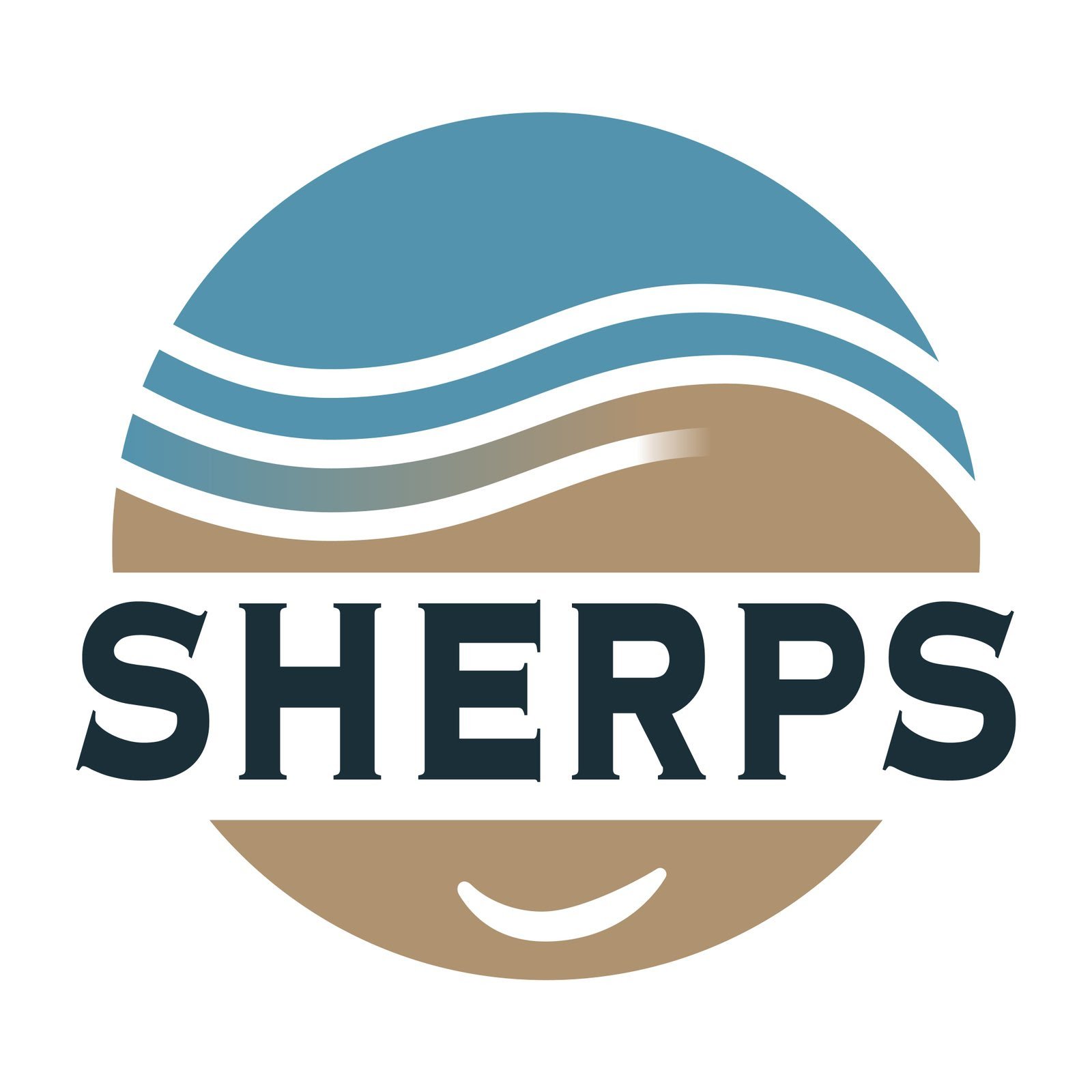
Logo 3: Same Same, but Different
With a new iteration of our logo came another designer and friend of our founder, Parker. Our third logo is more or less the same as its predecessor but is made to color match our app.
Unlike the DALL-E version, the background is transparent so that the logo is more versatile. With this improved version, it was immediately easier to imagine our logo on not only the website, but on the t-shirts that customers will come to recognize our Sherps by.
Logo 4: The Latest Logo Design
As you can see on the website, we now have two logos that we are working with: our main logo and a larger graphic that includes the latest logo.
This version was designed by a Fiverr designer (@mewindson) who did a great job, especially considering we asked for dozens of tiny tweaks.
You’ll notice the BS for Beach Sherpa (yes… we know) incorporated into the logo along with more unique colors to reflect a beachy vibe. This logo feels more like ‘us’ and is a great reminder that going back to the drawing board can be super useful!

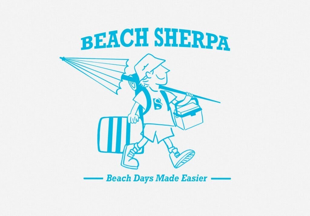
Beach Days Made Easier
The graphic is being designed by a third friend of our founder, Sydney. (Our founder, Mack, has great friends, if you can’t tell.) We couldn’t be happier with how it’s coming along. It incorporates so much of what that very first logo did without feeling nearly as overwhelming.
The Sherp here is wearing the kind of t-shirt our staff will actually be sporting on sunny Wrightsville Beach days, and the colors are in line with our updated branding.
Soon, you’ll be able to pick us out of a crowd because we will be looking JUST like this guy!
That’s a Wrap
So, there you have it! Our logo journey thus far.
We are so excited about the latest developments in our logo design, but we know that there is always room to improve.
So, tell us what you think. Does the latest Beach Sherpa logo and graphic represent a company that you would let help you trek your belongings across Wrightsville Beach on a sunny day? We sure hope so.
Leave your feedback in the comments, or get in touch with us on socials @beachsherps.
Pingback: Navigating the Waves: Launching Beach Sherpa - Beach Sherpa